Google dot org blog - News from Googles Philanthropic Arm

Learn about the human side of climate change with Kofi Annan

(Cross-posted with the Official Google Blog and the LatLong Blog)

Climate change is too often misunderstood to be simply an environmental issue, rather than a human issue. For our children and grandchildren, climate change is an issue of public health, economics, global security and social equity. This human side of climate change is explained in a new Google Earth tour narrated by former U.N. Secretary General Kofi Annan. Within these stories, you’ll find data and tools to explore this topic in more depth, and meet some of the people who are actively working on managing the risks of climate variability and change. We encourage you to take the tour to learn more about these human issues and the inspiring work of groups like the Alliance for a Green Revolution in Africa (AGRA) that are helping farmers cope with climate change. We hope this video will serve as a useful tool as educators help students around the world understand the complexity of this issue.


This is the latest in our series of climate change tours that we’re releasing leading up to the global U.N. Framework Convention on Climate Change (COP16) talks in Cancun, Mexico this week.

As part of the Google Earth for Educators Community, we’ve also created a special Climate Change Educators Resources page that teachers can use in their classrooms. Here, teachers can find the tools they need to create lesson plans about climate change, including all the individual Google Earth KML layers available for download. Teachers and students can overlay multiple data layers that help illustrate climate change, and discuss and analyze them as part of K-12 and higher education curriculum. We’re also looking for lessons plans for any school grade that use this narrated tour or these Google Earth KML layers, so if you’re a teacher or instructor, please submit your lesson plan for review now.


Visit google.com/landing/cop16/climatetours.html or the Climate Change Educators Resources page to learn more about climate change today.

Permalink | Links to this post |

Random Hacks of Kindness #2 - Come hack for humanity!

(Cross-posted from the Google Code Blog)

On the weekend of December 4 and 5, hackers will gather in cities around the globe to create software solutions that make a difference.

Google, Microsoft, The World Bank and Yahoo! are inviting software developers, independent hackers and students to participate in Random Hacks of Kindness (RHoK #2) next weekend.

RHoK brings together volunteer programmers and experts in disaster response for a two-day hackathon to create software solutions that focus on problems related to disaster risk and response. It is an opportunity to meet and work with top software developers and disaster experts, to create and improve open source applications that enable communities to recover from disasters, and to possibly win prizes.

Examples of previous hacks include the “I’m OK” app from RHoK #0 in November 2009, which was used during the response to recent earthquakes in Haiti and Chile, and the landslide prediction tool “Chasm,” winner of RHoK #1 in June 2010.

RHOK will be held simultaneously in many locations around the world. The five main stages will be in Chicago, Sao Paolo, Aarhus, Nairobi and Bangalore; and there will be over a dozen satellite events in other global cities. To find a location near you, see the latest list on the RHoK website.

Join us on December 4th and 5th, and visit www.rhok.org for more information.

Permalink | Links to this post |

In Africa, citizen cartographers tell their stories through their maps

(Cross-posted from the Google Lat Long Blog)

Earlier this month, we invited 60 of Google Map Maker’s top users in Africa to a community workshop in Nairobi. The event celebrated the contributions of exceptional mappers from across Africa who have collectively mapped hundreds of thousands of roads, cities and buildings, covering more than half the population in Africa. Participants from places including Burkina Faso, the Democratic Republic of Congo, Ethiopia, Gambia, Kenya, Morocco, Uganda, Rwanda, and Tanzania came together for this unique and inspiring opportunity to tell their stories, learn from each other, and share their mapping experiences using Google Map Maker. Check out the the Super Mappers Conference site for more details.


Meeting these passionate online mappers inspired all of us to think not only about creating maps to fulfill a practical need, but also about why we map and the deeply personal stories a map can tell. During these two days, we traveled to places that we perhaps may never see in person, but now mean more to us when we see them on a map because of the stories of mappers such as Noé Diakubama.

Noé grew up in the Democratic Republic of Congo (formerly Zaire), a country that has suffered many years at war. He is now living in Belgium and proud to give back to his country and people via mapping.

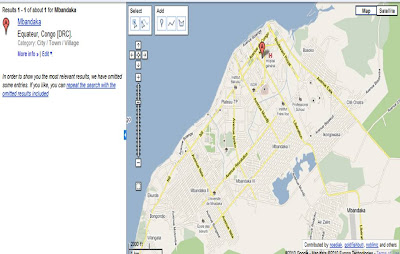
His mapping story began in Mbandaka, where he grew up. Noé liked to walk. Walking was about exploration and discovery. And Noé had many places to go, including secret spots to find wild vegetables and the EALA botanical garden. But without a map it was easy to get lost, so he could never wander too far from home. With his uncle, Noé sketched a small paper illustration of Mbandaka and its landmarks - that was his first experience with mapping! A few years later, he was surprised to find Mbandaka poorly represented on Google Maps; it only showed the city airport and two roads. Using Google Map Maker, he began mapping the roads by himself, and then asked friends and family to help him with adding local roads, their names and so on. Together, they created the first map ever of Mbandaka!


When I asked Noé why he maps, he replied:

Everyday, I spend hours and hours in front of my computer… mapping. My rewards include seeing a smile on the face of someone who sees for the first time the name of his/her street on the Internet, and knowing that someone benefited from the maps I created - kids journeying in the neighborhoods, business owners, or tourists. And ultimately, I want to see Africa being mapped and these maps made accessible to everyone. My message to other Africans: don’t be just a spectator, let’s all share our knowledge and start mapping cities and remote areas. We will soon, together, complete the mapping of our continent!

I’m used to seeing maps and thinking of them as a collection of edits or points of interests. It was an incredible feeling to personally meet and interact with the people behind the creation of the many dots on our maps. This was a gentle and welcome reminder that maps are not static. They’re alive, they’re personal, and they tell the stories of the people who create them. Mapping allows each of us to be a driving force for change and growth in both our immediate communities and the rest of the world. Let’s continue mapping, let’s stay connected through the Map Your World Community, and let’s continue doing amazing things together!

Posted by France Lamy, Program Manager, Google.org

Permalink | Links to this post |

Be Part of Improving Google Person Finder

Google Person Finder has become a useful tool in responding to natural disasters by reconnecting people with their family and friends. We’ve been looking at the next phase of Google Person Finder and decided to begin hosting the open source project at Google Code. We’re inviting the developer community to help improve Google Person Finder and the PFIF data format.

Google Person Finder provides a common place to search for, comment on, and connect records from many missing person registries. After the January 12th earthquake in Haiti, a team of Googlers worked with the U.S. Department of State to quickly create a site that helped people who were affected by the disaster. The site was used heavily after the Chile earthquake in February and put in action again in April after the Qinghai earthquake in China and in August for the Pakistan floods.

The software powering Google Person Finder is open source so we’re listing the open issues and feature requests we’ve received over the past few months in hopes the community can help us improve the code. We’ve created a Developer Guide to help developers get started. As always, we invite those interested to post questions on our public Person Finder discussion group. Those who are interested in improving the PFIF data format can also join the PFIF discussion group.

In addition to opening our product for developers, we’ve decided it’s now time to turn off our Google Person Finder instances for Haiti, Chile, China, and Pakistan. It doesn’t seem useful to be serving these missing person records on the Internet indefinitely, so we intend for each instance of Google Person Finder to be running for a limited time. Once an instance has served its purpose, we will archive the PFIF records in a secure location for historical preservation for one year while we work to identify a permanent owner for these records. Assuming a long-term owner cannot be found, we will delete the records after one calendar year. For more information, please feel free to review the Google Person Finder FAQ.

Permalink | Links to this post |

Comparing Flu Around the World

Earlier this year, we asked a global group of public health officials and influenza experts how we can make Google Flu Trends better. Their most common request was for visualizations that enable easy comparison of flu levels across regions, so that differences in the trend of the season could be easily identified. We now publish the flu levels of all countries and regions on Google Public Data Explorer which provides this feature and much more. Also, as part of our annual model update for the Northern Hemisphere, we’re refreshing our models in 13 countries and adding new regional estimates for the Netherlands, Belgium, Canada, Switzerland, and Spain.

It’s important to note that the flu level is a normalized number indicating how unusually high or low our estimate of flu-related activity is in a place. Zero means business as usual. Eight means flu activity is unusually high for that country or region. So, you can’t use these visualizations to say there was more flu in one place than in another, but you can know whether the situation deviated more from normalcy in one location than in another.

Let’s look at some of the ways these new visualizations allow us to compare flu activity across the globe:

Has the flu season started in Western Europe? There was a bit of activity in Germany and Austria at the beginning of October. Otherwise, there is not much flu in that region as of this week.


Let’s look at the data on a map. On the chart below, each bubble has a size proportional to the flu level for November 9, 2008 (a minus sign indicates less flu activity than is usual). The flu season hasn’t started anywhere. Hit the “Play” button to see how the flu season develops first in the Northern hemisphere.


Check out how flu seasons alternate between the northern and southern hemispheres.


Click on "Explore data" in any one of the charts above to go to Public Data Explorer and start exploring!

Permalink | Links to this post |

Helping you find emergency information when you need it

We know that in times of crisis, it's especially important for you to find the crucial information you're looking for—and find it fast. Today, in 13 countries, we’ll begin displaying some combination of special search results for searches around poison control, suicide and common emergency numbers that point to emergency information.

This effort started last year when I received an email from a mother in the U.S. who had trouble finding the phone number for the poison control hotline after her daughter accidentally ingested something potentially poisonous (fortunately, her daughter was fine). As a result, people in the U.S. performing various searches including "poison control" began to see a special result displaying the national phone number for the American Association of Poison Control Centers last fall.

Example of the poison control result in Spain

Soon after we added poison control information to search results, we heard from Googlers whose lives had been affected by suicide and who thought that suicide prevention could be another case for a special search result. In April we began prominently displaying the number for the National Suicide Prevention Lifeline at the top of the results page for certain search queries in the U.S. Since then, our friends at the National Suicide Prevention Lifeline have reported a 9 percent increase in legitimate calls to its hotline.

Example of the suicide prevention result in the UK

So, following positive feedback from consumers and our hotline partners, we decided to expand the poison control and suicide prevention special search results beyond the U.S. Each of these 13 countries will see one or more of these results: Australia, Belgium, France, Germany, Hungary, Italy, Netherlands, New Zealand, Norway, Spain, Sweden, Switzerland and the United Kingdom. We looked for hotlines that are available nationally and 24/7 and we hope to add additional countries in the future.

We're also introducing a new special search result for common emergencies, such as fire, medical and police emergencies. We want to make this information easier to find for residents as well as travelers, especially as some countries have different numbers for different emergencies.

Example of the emergency number result in France

An emergency is stressful enough. We hope this small step helps connect people with the information they need immediately.

Permalink | Links to this post |